2016 VS 1967
The 1967 film makes the audience feel as though the film is targeted towards the younger generation, as the 2016 film has more of a serious effect on it as there is a darker tint.
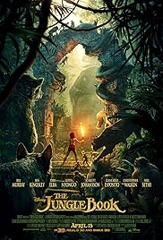
The way Disney have produced the 2016 movie, is with excellent CGI for the animals throughout the whole of the film.
The colors used in the 1967 jungle book are very bright and vibrant, which is very appealing for any audience that go to see this. Unlike the 2016 movie where it makes the film look more dangerous and adventurous. Although it is still for kids, Disney have designed this poster to make it suit the genre that this fits into around this time of life.
The 2016 movie poster has been made to look very professional as the cast have been mentioned on the front and the text at the front is bold and gold, this will appeal lots of people who are going to watch the film. Unlike the 2016 poster, the 1967 poster has no other writing on it other than the title. This gives the audience more of a feel of what the movie will be like.
No comments:
Post a Comment