Monday, January 20, 2020

Monday, January 13, 2020
Jungle Book- Movie poster compare
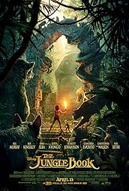
2016 VS 1967
The 1967 film makes the audience feel as though the film is targeted towards the younger generation, as the 2016 film has more of a serious effect on it as there is a darker tint.
The way Disney have produced the 2016 movie, is with excellent CGI for the animals throughout the whole of the film.
The colors used in the 1967 jungle book are very bright and vibrant, which is very appealing for any audience that go to see this. Unlike the 2016 movie where it makes the film look more dangerous and adventurous. Although it is still for kids, Disney have designed this poster to make it suit the genre that this fits into around this time of life.
The 2016 movie poster has been made to look very professional as the cast have been mentioned on the front and the text at the front is bold and gold, this will appeal lots of people who are going to watch the film. Unlike the 2016 poster, the 1967 poster has no other writing on it other than the title. This gives the audience more of a feel of what the movie will be like.
Daily Mail Front Cover evaluation
1) what was the task you were given and who was the target audience?
I was given a task to create my own version of the daily mail using up to date news, for example the flash flooding in the UK. My target audience for this newspaper would've been people in the demographic of B-D because there are adverts given away free holidays showing that this usually isn't sold to wealthier people.
2) What research did you undertake and what were some typical conventions of the Daily Mail?
I researched hard news such as flash flooding and the bush fires in Australia, and a lot of typical conventions i found were there is usually one hard and soft news taking up the majority of the front cover.
3) Which daily mail mail cover did you use for your main source?
I used the cover with Einstein because it showed a good proportion of hard to soft news
4)which areas did you find most challenging?
I found the details of each news article challenging as i ran out of ideas to talk about as i covered it all within a few paragraphs.
5) What was your initial feedback? What did others say?
I really liked my design for the newspaper as it really looked as though it was a professional print. Others in my class thought the same.
6) Identify what went well?
What went well was how i kept the proportion of hard to soft news very even like most daily mail covers hold.
Monday, December 16, 2019
Friday, December 13, 2019
300 word newspaper answer
Write a 300 word answer on how your newspaper targets its audience? Use PEAL as a paragraph structure
The daily mail targets its audiences in a very specific way.
As you can see from the front cover is talking about the environment and
celebrity gossip, clearly they are not interested in attracting people who are
interested in hard news. As you can see from the top of the article where it
says ‘FREE’ shows the audience that they care about them and they know that the
majority who read this newspaper are demographic C-E, so they are promoting
things for people to apply for to get for free. The colours used on this paper
are very appealing to the readers because they use a variety of vibrant
colours.
When I was talking about the soft news all on the front,
inside the newspaper I have found a variety of hard news articles which means
that they are pulling in people who don’t care about politics and then they end
up reading it, and some people end up enjoying it. This is a good way of
getting people to read it who are into a bunch of different categories in soft
and hard news.
The bold black writing in the middle, takes up the majority
of the paper, this is to get the audience involved straight away with the
celebrity gossip that is going down in the world, and to push people away from
all the stressful hard news that is happening at the moment.
Subscribe to:
Posts (Atom)