Q2 DIRTSHEET
Sunday, September 27, 2020
Monday, September 21, 2020
Tuesday, April 21, 2020
Monday, March 23, 2020
Big issue comparison and Essay

DENOTATIONS
- Powerful white man who is in control of the world
- North and South America are both shown on the world
- The blue clear space around him shows that nobody is in distance of him, he's in his own world
- The caption 'TRUMP WORLD' is in gold
CONNOTATIONS
- The picture of Donald Trump suggests he is the main topic in this magazine
He is holding an American flag which suggests its going to be about Trump taking over America and the world- The fact that 'TRUMP WORLD' is in gold shows how rich and powerful he is compared to everyone else
REPRESENTATION
- Donald Trump is an important figure through recent American times
- The cover represents power over the world, and one person who feels as though he is in his own world

DENOTATIONS
- The globe is in the centre of the cover showing that Trump is taking over the world or something of that sense
- 'what's the WORST that could HAPPEN' is in white bold font
- There is thunder in the background of the cover to represent hell or just destruction
- Trump is flying on an Eagle like he is above everyone else in the world
CONNOTATIONS
- Trump is in the middle meaning that this is all about him and how he is changing the world
- Trumps head is very big, showing that he is too big for his shoes
- 'worst' and 'happen' are in bold because they know something bad will happen eventually
REPRESENTATION
- Donald Trump is important but also could cause catastrophe in the future
- The cover represents power over the world, and one person who feels as though he is in his own world
COMPARISON
- Both magazine covers show Donald Trump to be an overpowered man of the world and nothing can seem to stop him
ESSAY
Explain how the representations in magazines reflect their contexts?Representation in magazines, especially in the two covers that I covered reflects their contexts in a variety of different ways. Firstly, due to the fact that DR CAGES has been used massively in the representation, because Donald Trump has been shown as the power house of the world. There is only 1 person on there and that is a male. The big issue has made Gender an extreme point to make in this question as sexuality and gender has been shown to make men look like they can be the only powerful people who could take over the world, where as many women out there can do the same thing. The fact that the white ethnicity is the only ethnicity shown within these two front covers shows that they believe white power are more significant, but black people are as powerful if not more.
The places representation in these magazine covers are very significant to the contexts as the fact the big issue have placed the earth on both covers means that they are representing Donald Trump to be the king of the world, when they are actually representing him as a bad person who could make bad choices whilst he’s the president. Also as you can see from the second magazine that I analysed there is thunder in the background which could represent hell on even just him destroying the world with his ideas. This could influence people to hate him and go against him in what he does. These magazines have a huge impact on what is actually going to happen with famous celebrities such as Trump because with millions of magazines going around the world annually, there are a lot such as the 2 big issue covers I analysed that represent Trump as someone who could ruin the planet.
A lot of magazines tend to show upper class celebrities such as Trump or Markel because they are the most powerful of all, and this could interact a lot more people into the magazine. This makes people think about the context of the magazine and what is actually happening. As I said before hand about the world being shown on the big issue covers, they don’t specify any specific regions of the world, this could cause catastrophic events around the world if Trump feels as though he can take over the world because people feel as though they shouldn’t be overruled by someone who feels as if he’s on top the world.
Saturday, March 21, 2020
The Big Issue
The Big Issue is a street newspaper founded by John Bird and Gordon Roddick in September 1991 and published in four continents. The Big Issue is one of the UK's leading social businesses and exists to offer homeless people, or individuals at risk of homelessness, the opportunity to earn a legitimate income, thereby helping them to reintegrate into mainstream society. It is the world's most widely circulated street newspaper.
CLIFT
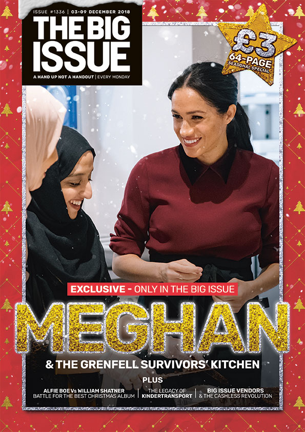
The colour of this front cover is very vibrant and colourful, this is too make the audience who are reading this feel as though Meghan is a very nice and warm hearted person, although she may not be like that in real life. The layout of this cover has Meghan Markle seem as though she is the most important person there alongside the two women that she is making smile. They've done this to create a positive atmosphere around the situation that is taking place. The image to text ratio in this cover is very huge because they want to make Meghan the stand out person, so they felt that any text would've been irrelevant when making this cover, although the font of the text says a lot. For example the word 'MEGHAN' is in glittering gold writing meaning they are describing her as a woman who couldn't put a step wrong and is only doing good things in her life.
MCSPA
The masthead on this front cover is 'MEGHAN', so straight away the big issue paper has already grabbed the readers attention on Meghan Markle by making her the main story for the whole paper that week. Meghan Markle is the cover star of this paper and you can tell this because she is the only person on the front cover and she is made out to be helping others, where most people know that this could be faked as she knows she is being photographed and filmed.
CONTEXTS
The fact that the big issue paper have included different races on the front cover shows that the want to allow the audience to understand that not all people are bad, and they placed Meghan next to them to show that anyone can get along, although Meghan probably is faking her expressions towards them.
REPRESENTATION
The messages that are being communicated are that people of different races can get along and even if your rich or poor, you can still be friends and hang out together. This cover shows this by showing that Meghan Markle is giving her time up to visit people who aren't as fortunate as some. The big issue has focused more on race on this cover than anything else as the UK are battling against foreigners entering the country, they have made this cover to show the country that they aren't all as bad as people may think. The fact that they've not included any males in this cover shows that they are also promoting women and how they can be strong together and make a difference to people who aren't as fortunate as others.
CLIFT
The colour of this front cover is very vibrant and colourful, this is too make the audience who are reading this feel as though Meghan is a very nice and warm hearted person, although she may not be like that in real life. The layout of this cover has Meghan Markle seem as though she is the most important person there alongside the two women that she is making smile. They've done this to create a positive atmosphere around the situation that is taking place. The image to text ratio in this cover is very huge because they want to make Meghan the stand out person, so they felt that any text would've been irrelevant when making this cover, although the font of the text says a lot. For example the word 'MEGHAN' is in glittering gold writing meaning they are describing her as a woman who couldn't put a step wrong and is only doing good things in her life.
MCSPA
The masthead on this front cover is 'MEGHAN', so straight away the big issue paper has already grabbed the readers attention on Meghan Markle by making her the main story for the whole paper that week. Meghan Markle is the cover star of this paper and you can tell this because she is the only person on the front cover and she is made out to be helping others, where most people know that this could be faked as she knows she is being photographed and filmed.
CONTEXTS
The fact that the big issue paper have included different races on the front cover shows that the want to allow the audience to understand that not all people are bad, and they placed Meghan next to them to show that anyone can get along, although Meghan probably is faking her expressions towards them.
REPRESENTATION
The messages that are being communicated are that people of different races can get along and even if your rich or poor, you can still be friends and hang out together. This cover shows this by showing that Meghan Markle is giving her time up to visit people who aren't as fortunate as some. The big issue has focused more on race on this cover than anything else as the UK are battling against foreigners entering the country, they have made this cover to show the country that they aren't all as bad as people may think. The fact that they've not included any males in this cover shows that they are also promoting women and how they can be strong together and make a difference to people who aren't as fortunate as others.
Friday, March 13, 2020
Friday, February 28, 2020
Monday, January 20, 2020
Monday, January 13, 2020
Jungle Book- Movie poster compare
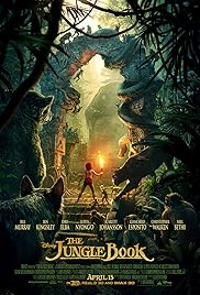
2016 VS 1967
The 1967 film makes the audience feel as though the film is targeted towards the younger generation, as the 2016 film has more of a serious effect on it as there is a darker tint.
The way Disney have produced the 2016 movie, is with excellent CGI for the animals throughout the whole of the film.
The colors used in the 1967 jungle book are very bright and vibrant, which is very appealing for any audience that go to see this. Unlike the 2016 movie where it makes the film look more dangerous and adventurous. Although it is still for kids, Disney have designed this poster to make it suit the genre that this fits into around this time of life.
The 2016 movie poster has been made to look very professional as the cast have been mentioned on the front and the text at the front is bold and gold, this will appeal lots of people who are going to watch the film. Unlike the 2016 poster, the 1967 poster has no other writing on it other than the title. This gives the audience more of a feel of what the movie will be like.
Daily Mail Front Cover evaluation
1) what was the task you were given and who was the target audience?
I was given a task to create my own version of the daily mail using up to date news, for example the flash flooding in the UK. My target audience for this newspaper would've been people in the demographic of B-D because there are adverts given away free holidays showing that this usually isn't sold to wealthier people.
2) What research did you undertake and what were some typical conventions of the Daily Mail?
I researched hard news such as flash flooding and the bush fires in Australia, and a lot of typical conventions i found were there is usually one hard and soft news taking up the majority of the front cover.
3) Which daily mail mail cover did you use for your main source?
I used the cover with Einstein because it showed a good proportion of hard to soft news
4)which areas did you find most challenging?
I found the details of each news article challenging as i ran out of ideas to talk about as i covered it all within a few paragraphs.
5) What was your initial feedback? What did others say?
I really liked my design for the newspaper as it really looked as though it was a professional print. Others in my class thought the same.
6) Identify what went well?
What went well was how i kept the proportion of hard to soft news very even like most daily mail covers hold.
Subscribe to:
Comments (Atom)